The Short History of Women's Fencing
Exploring the history of women's olympic saber fencing.
Timeline
4 Weeks
Role
Individual Project for MIT's Information Design Studio
Tools
Figma, p5.js
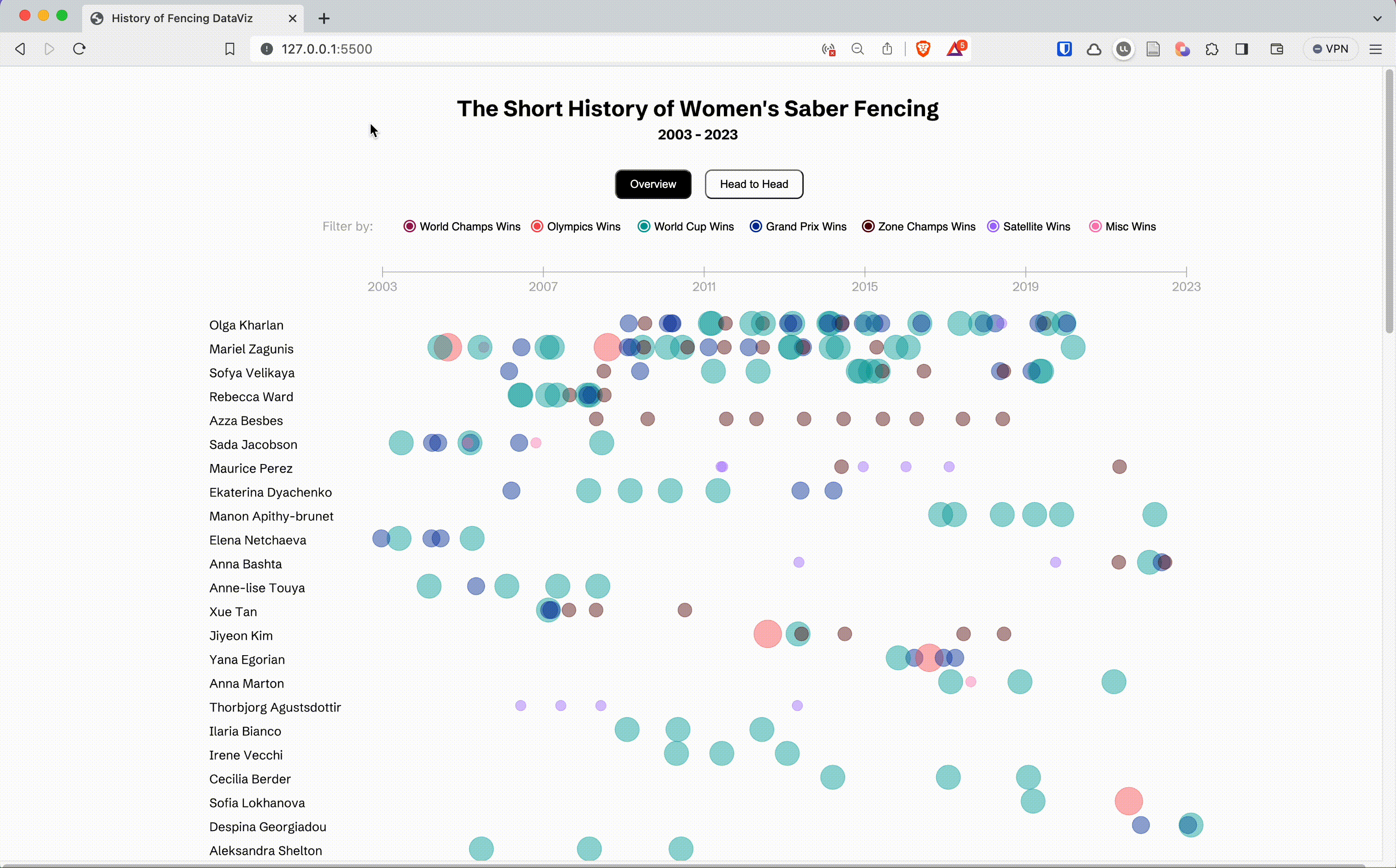
Who is the G.O.A.T of Women’s Saber Fencing?
Visualizing Fencing History (2003-2023)
Project Context
As a culminating project for an information design and visualization course at MIT, I transformed complex historical data from senior women’s saber fencing events into an accessible and engaging visual narrative. Ultimately creating an interactive data visualization showcasing the winners of senior women’s saber fencing events from the recognition of the sport as an Olympic event to the present day (2003-2023).
Despite the fact that men’s fencing debuted in the first Olympic games, women’s fencing has only recently been recognized. I sought to highlight this disparity by showcasing the short history of the women’s event.
A Passion Project
 I have been a fencer since I was 12 and took on this project as an opportunity to highlight a relatively obscure sport. My objective was to capture the essence of the sport’s senior women’s saber category by encapsulating the evolution of its champions across two decades.
My Process
Creating Figma Mockups
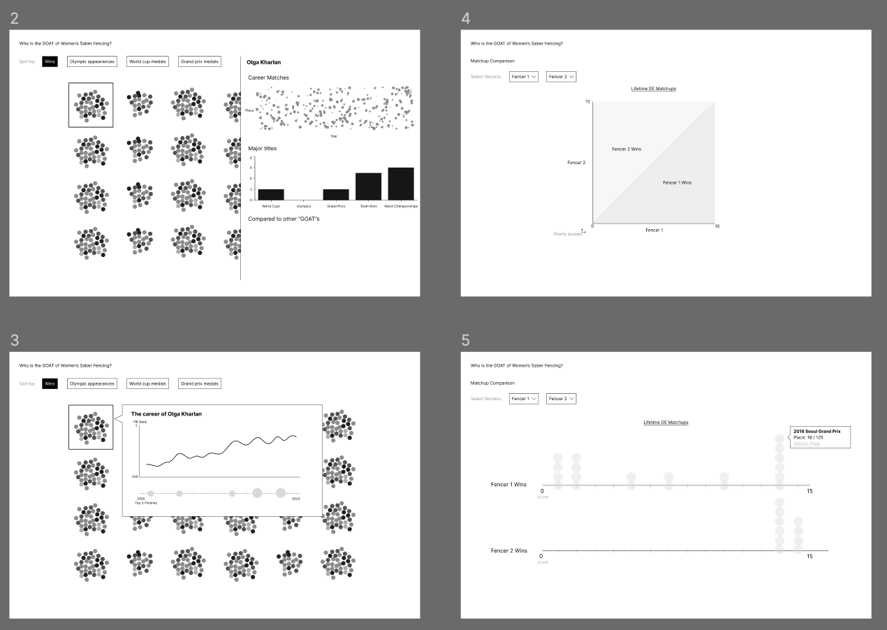 Figma served as the canvas where I translated my ideas into visual mockups and sketches. By plotting out the visualization’s structure, I envisioned its dual functionality: an overview of tournaments and a detailed head-to-head comparison. I worked to refine the readability of the data and design key interaction points to ensure usability.
Creating a Dataset with Python & Web Scraping
Transforming concepts into reality necessitated finding a dataset with historical fencing results. The problem? That dataset didn’t exist. Building upon an existing Python scraping project from GitHub, I worked to restructure the code to scrape the international fencing federation’s website for results from the last two decades of saber fencing tournaments. I then underwent the arduous process of cleaning and labeling the data so I could work with it in p5.js.
Developing the Concept with p5.js
Using p5.js to build the interactive visualization, I created a dynamic digital experience that offers two distinct screens, each catering to different dimensions of the sport of fencing: head-to-head and overall rankings.
The User Experience
Wins Overtime
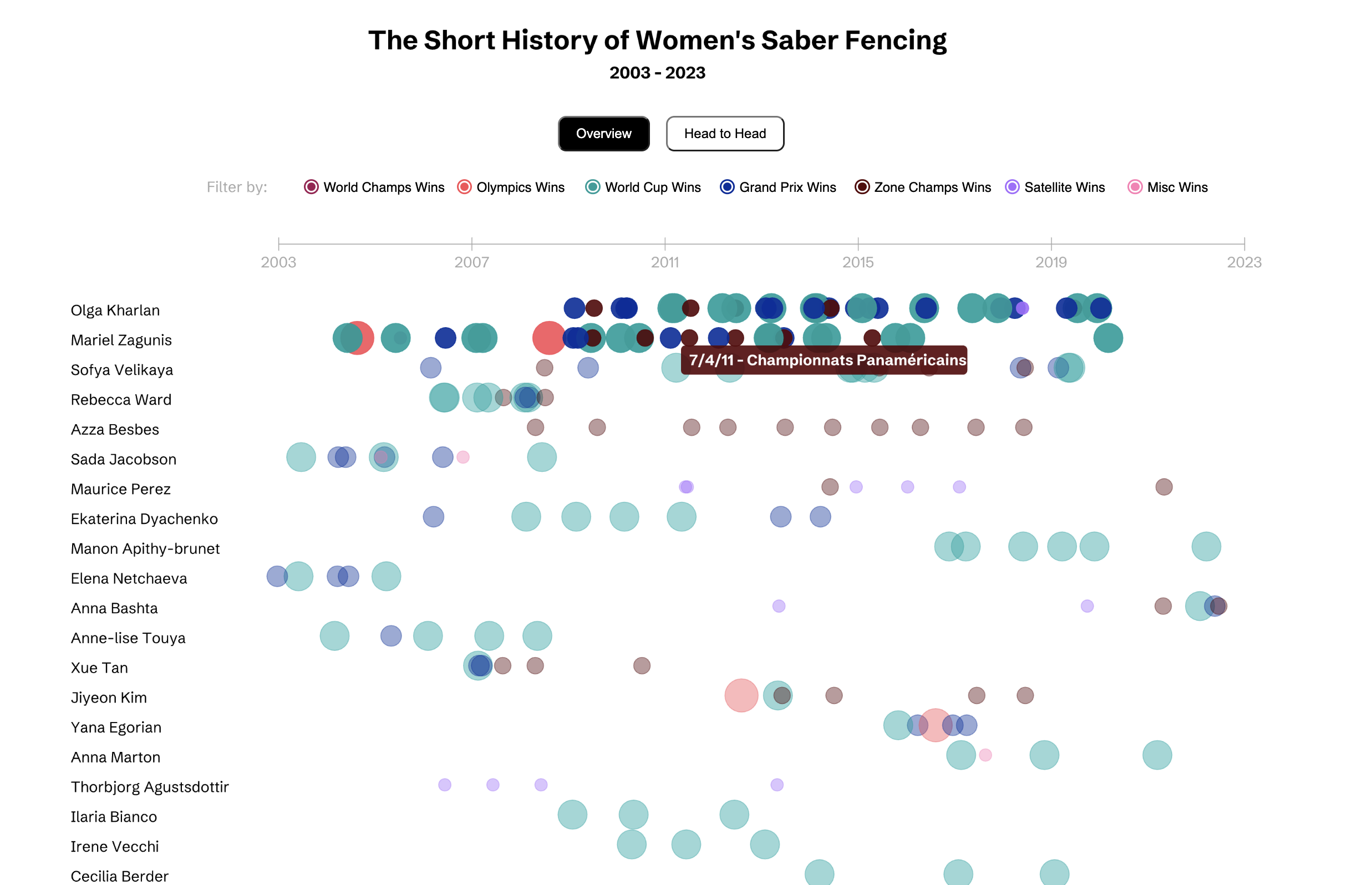
The initial screen focuses on the entire history of women’s saber fencing by providing an overview of individual fencer’s wins and losses overtime. Users can trace the trajectories of fencers, observe the rise of champions, and gain an appreciation for the sport’s evolution. When viewing this screen, I hope users appreciate the dominance of several key players in fencing’s history, they are the “Serenas” of my sport.
Head-to-Head Comparison: Delving into Rivalries
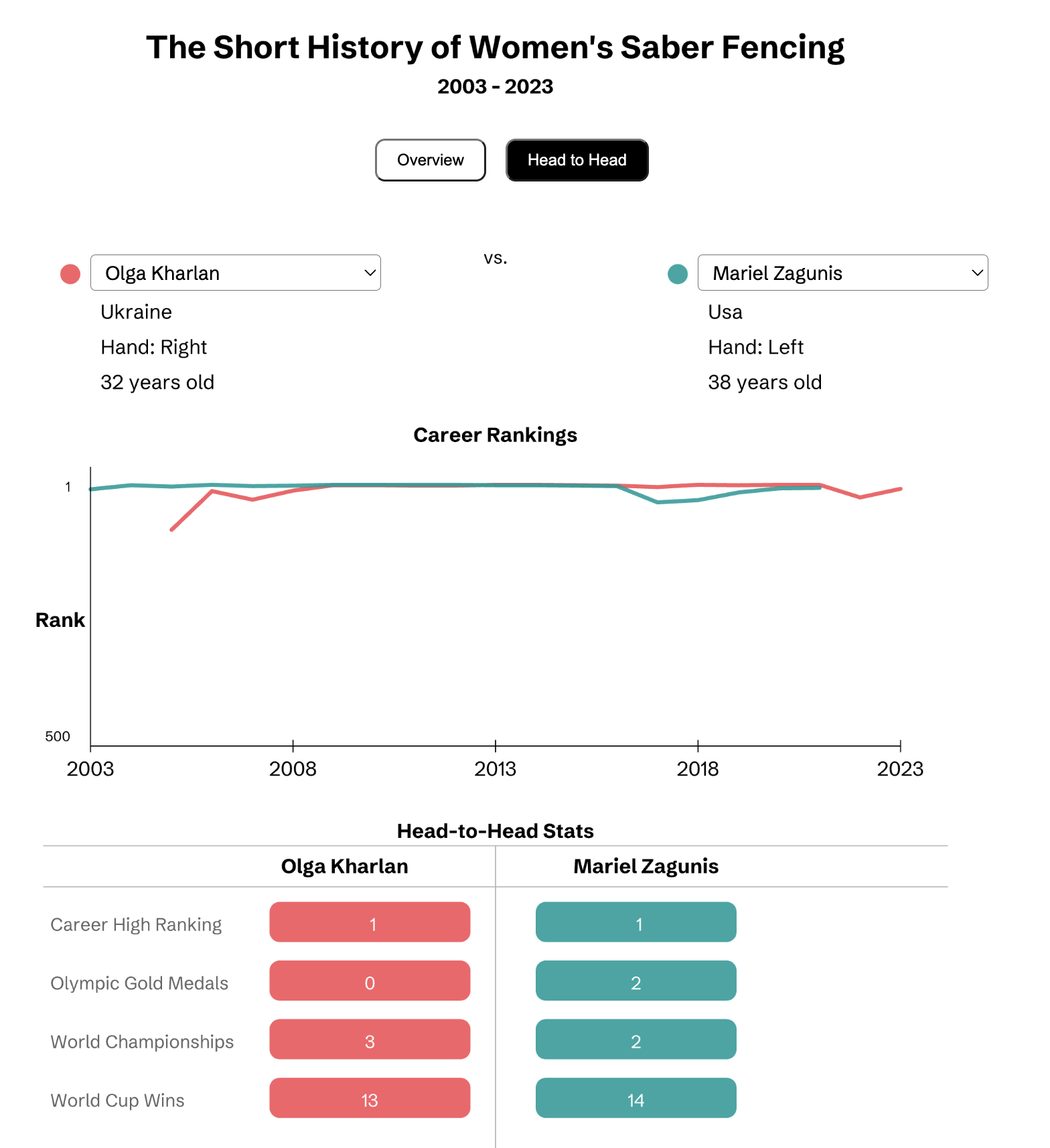
The second screen delves into the microcosm of fencing rivalries. Users can select specific fencers and instantly summon a head-to-head comparison. This feature adds depth to the exploration, offering insights into the dynamics between athletes who have left their mark on the sport.
Learnings and the Future
This visualization was a chance to delve into the intersections of sport, data and design, a particular passion of mine. In the future, this visualization could be extended to other fencing categories and provide a way to enhance knowledge of the sport.
I was inspired by my love of FiveThirtyEight’s sports visualizations when making this project and continue to be motivated by the way data can bring to light the disparities in the sporting world. In the future, I’d love to do a broader comparison that shows the contrasting ways fencing has evolved across genders.
Last updated on: May 12, 2023